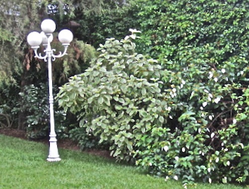
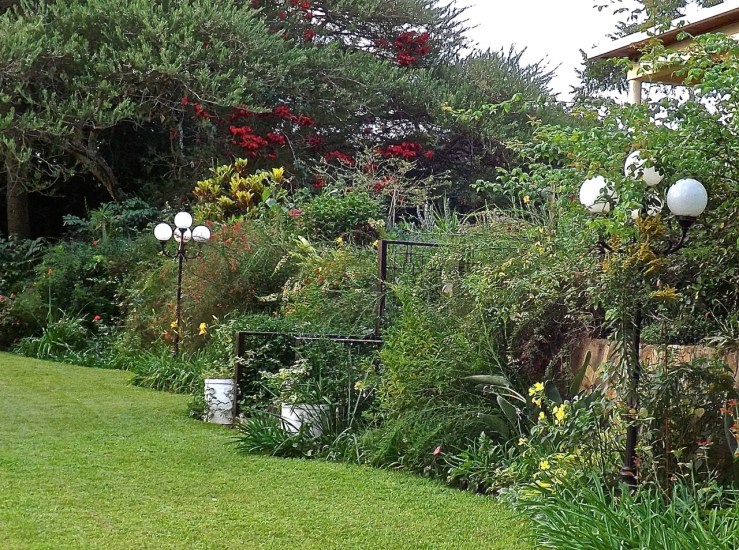
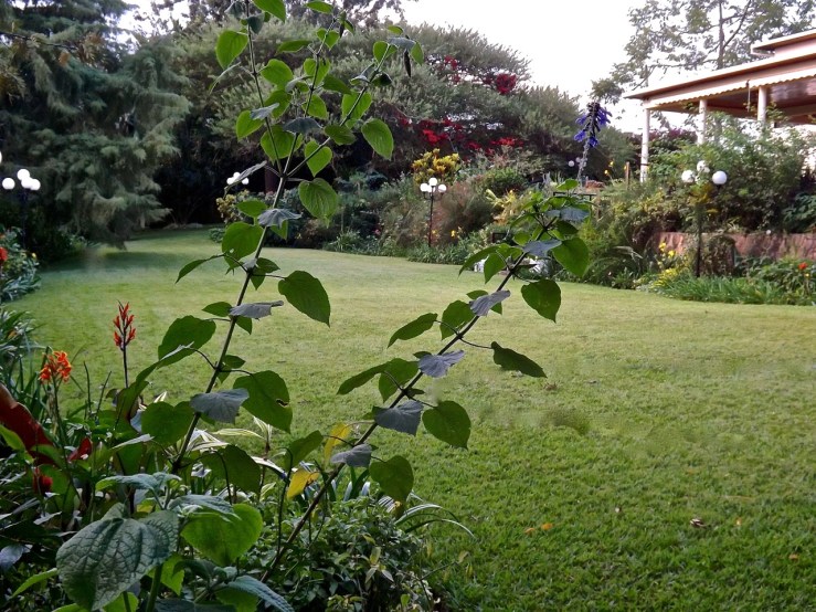
Our garden lights before:
And after:
The dark chocolate brown matches the ironwork on the house.
Also, I had remembered reading long ago, advice by Ken Druse that dark brown was the best color for making less-than-beautiful garden features recede. (He specifically recommended Cabot’s Solid Color Stain in “Spanish Moss.”)
Now, in the evening, we just see floating white balls.


What a difference that makes in what is already a fascinating and lovely space.
Even before we arrived, I had those light posts in my sights — having seen some photos of the garden.
Things are actually starting to look quite nice now — It’s been a year since we started making changes to the garden, and a lot of transplanted plants have re-gained their past size and are flowering. Today, we are actually attacking the vegetable garden, which has been a bit left behind.
Much better with the brown posts! Great advice from Ken Druse. Y’ know, I actually am kinda fond of those “floating white balls”-style lights. I guess they’re sort of dated but they have character & to me look like little moons hovering in the air.
You know I clipped the little Ken Druse article out of Garden Design magazine in 2001; I knew it would be useful one day.
I was looking at these photos and then at the garden, and I realized that dark brown is a substantial “natural” color among the plants because it the color of the shaded areas between the leaves. So something painted that color will just sort of slip in.
I love the white balls now that I have kind of gotten rid of the pseudo Victorian light posts, which don’t go with the more modern house at all.
I will endeavor to remember the dark brown advice…it surely works in your garden.
My very briefly considered plan B was to go for the whimsical and paint each pole a different shade of green or green/blue for an ombre effect. But I thought that would only stay fun for about a month.
Plan B definitely sounds like a one week plan.
We changed our ‘white wrought iron’ garden furniture to verdigreen – and achieved a similar, no longer in your face effect.
If the posts had the same general style as the house, I would have like verdigreen, but since they are so different, I just want them to fade.
your garden is tipping from Yes, dear, very nice – to spectacular!
Thanks! It’s heading that way, anyway. The plants are really filling out. I’m even starting to divide the best ones again and to replace some less interesting ones that were just placeholders. It’s been almost exactly a year since we started making big changes.
Definitely much better, they kind of dissapear in the green, I guess they look great at night.