The Jersey shore

“Happy and beautiful, Atlantic City, N.J.,” 1903.

To give to the American Red Cross, click here. You can also donate through the iTunes Store.

There are links to other organizations, like the Methodist Church and the Salvation army, at this post by Foot’s Forecast.  (Thanks to Pigtown Design for the tip.)

Photo possibly taken by B.W. Kilburn, via Library of Congress Prints and Photographs Division.

Vintage landscape: Rabbit redux

(Chapter the first, here.)

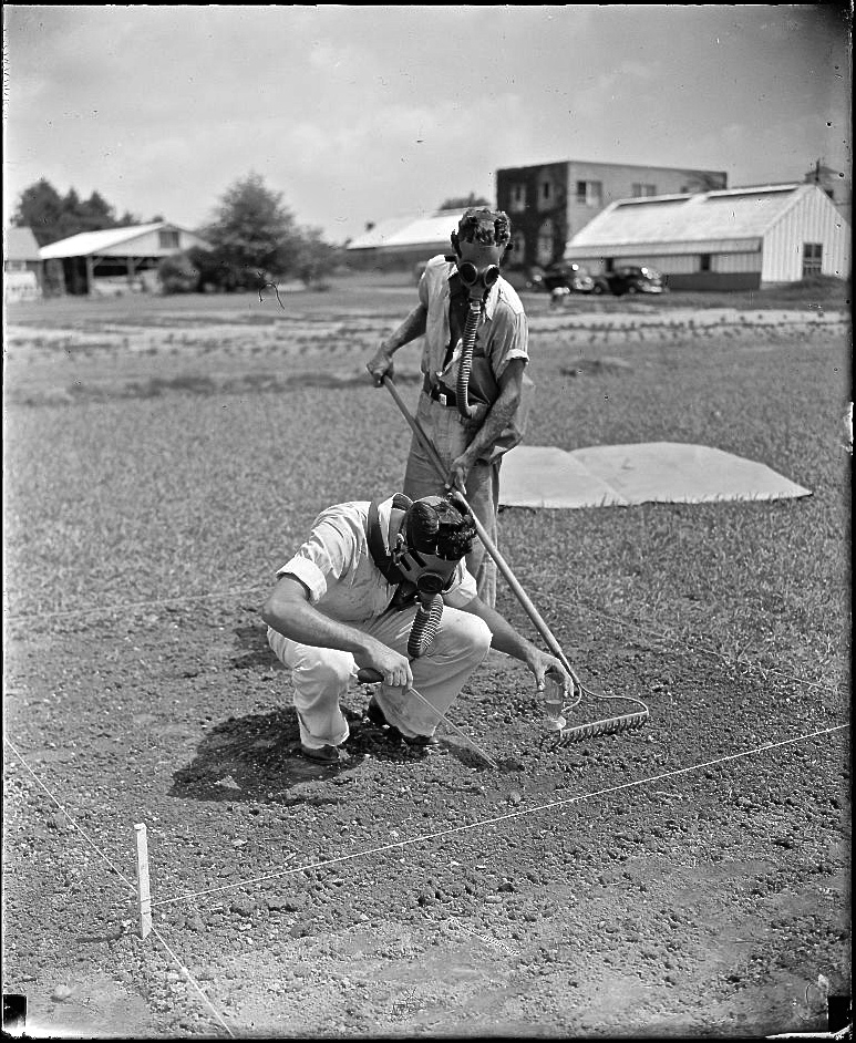
“Government experts test power of gas to keep weeds out of golf greens. Washington, D.C., Aug. 4[,1938].

“Attention golfers!! Your putting is bound to improve and your cussing cut down if the tests now being conducted by grass experts of the Department of Agriculture on the use of tear gas to keep weeds out of golf greens are successful. A.E. Rabbit, (left) grass specialist of the United States Golf Association with whom the Department of Agriculture is cooperating in making the tests, is pictured as he pours the gas into the soil while Stanley Graeff, Dept. of Agriculture, rakes it over. The gas treatment was developed by Dr. John Monteith of the Department of Agriculture.”

Photo and text in quotes by Harris & Ewing via Library of Congress Prints and Photographs Division.

Our garden: blue hills, yellow flowers

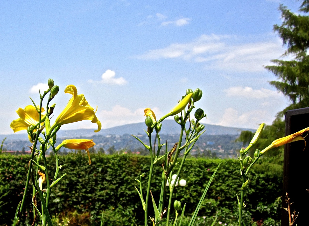
The landscape in the distance can provide one of the colors in a planting bed combination.

That’s come home to me this week as I’ve noticed how great the yellow daylilies in front of our terrace look against our view of the blue Kigali hills and sky.
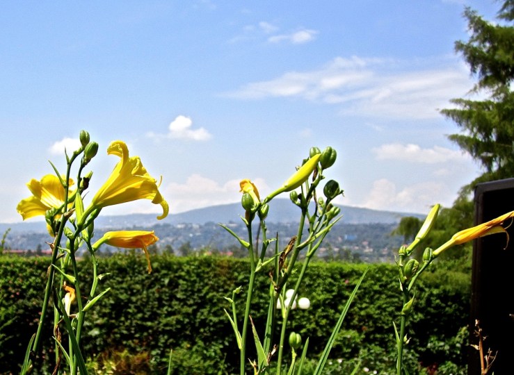
Classic blue and yellow are working really well in this open, bright area.  (The columns of the terrace are pale yellow too.)

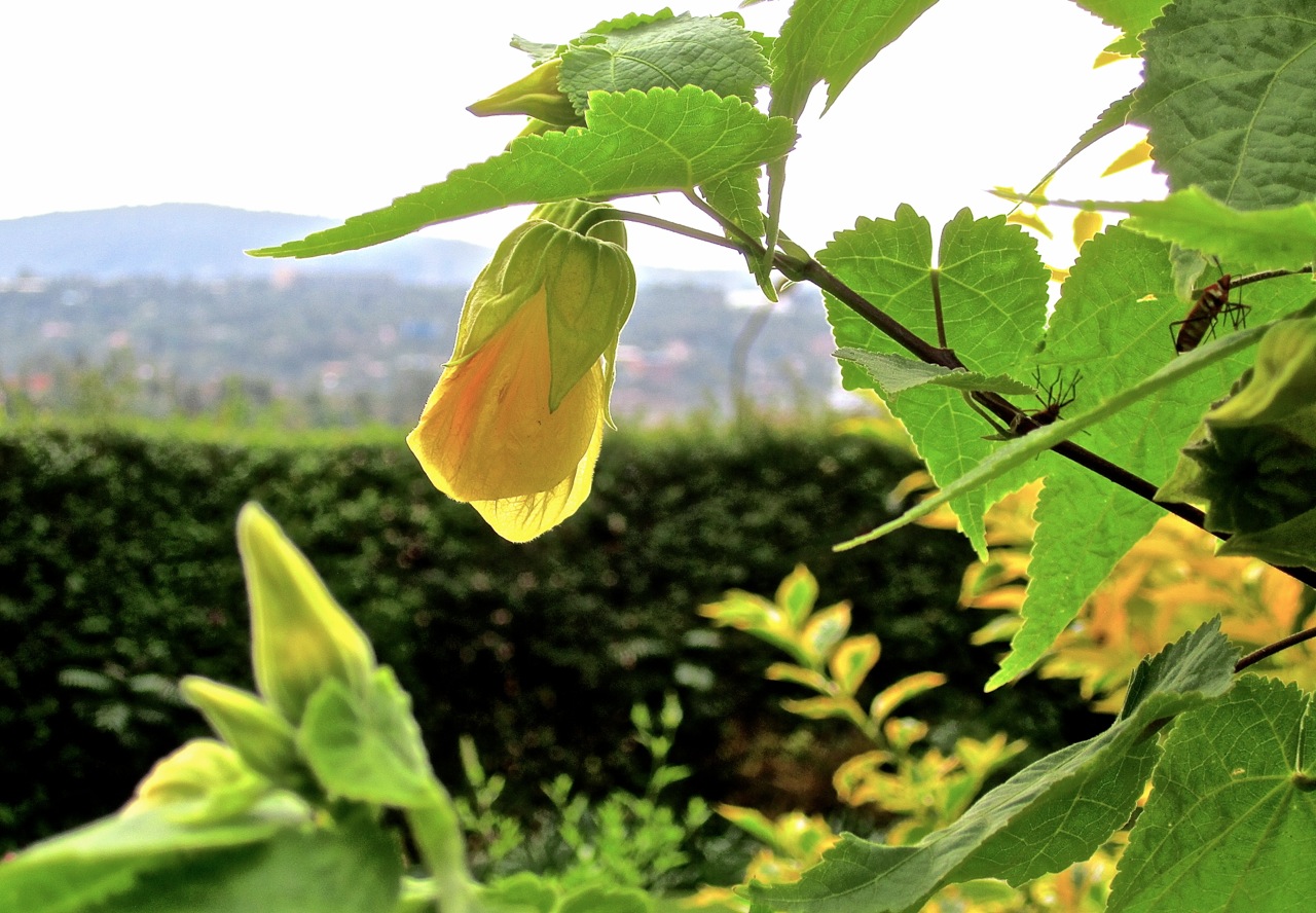
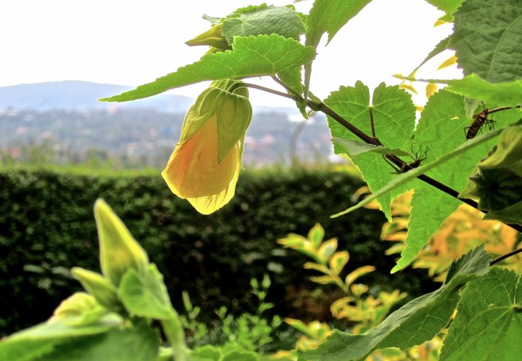
Below are yellow abutilon and yellow foliage in the same area. I need to bring some cream into the mix.

 
As the garden comes back from our  all the changes we made this summer, I’m starting to think more comprehensively about structure/color combinations in the planting beds. In June, as my two temporary helpers were fast digging up swathes of shrubs and flowers, there wasn’t a lot of time to get too prissy about perennial placement — I knew where I wanted the shrubs and grass, my main concerns for Phase One.

Quickly, I tried to direct the placement of the other plants into something like the ever-advised drifts, but as things fill in, I’m not getting the overall “clarity” (the word that most comes to my mind) that I want. So I need to get the shovel back out. (But these daylilies are good.)

I’m thinking about this observation on the relationship between plant color and form by Piet Oudolf:

Different shapes + different colours
There is a danger that there will be too much contrast. The eye may be overstimulated, and there may be no common ground.

He goes on, however, to say that “this is only a suggestion to be cautious. . . as even outrageous contrasts may work!”

He indicates that easier approaches may be:

  • Related shapes + related colours
  • Different shapes + related colours [Think Nori and Sandra Pope — I am.]
  • Related shapes + different colours

(from Designing with Plants.)

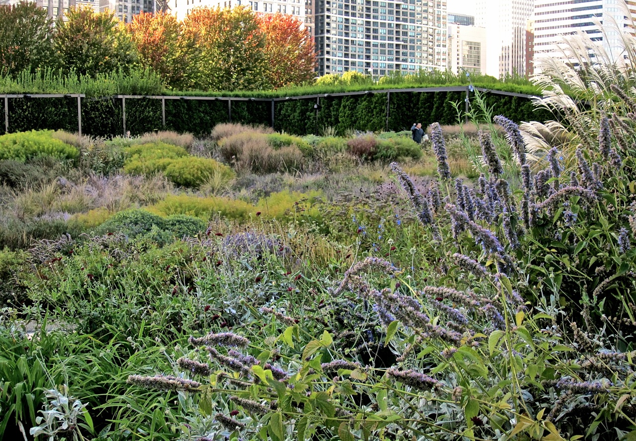
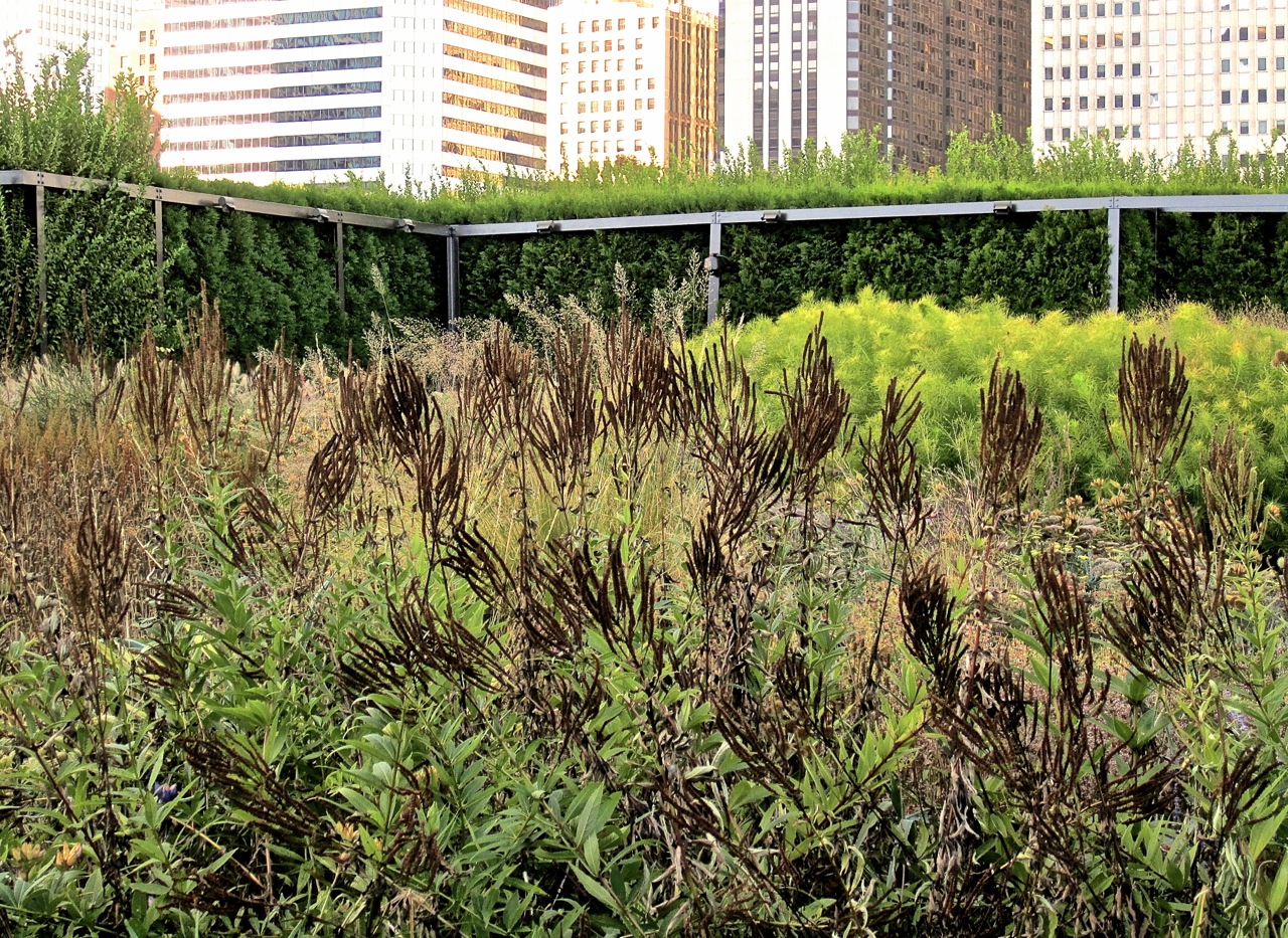
In September, we visited Chicago, and I spent some time in the Oudolf-designed* Lurie Garden.  In the large section in the photo below, fading shades of purple predominated.
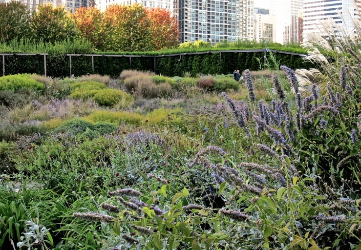
Seed heads in dark brown, below, provided contrast.
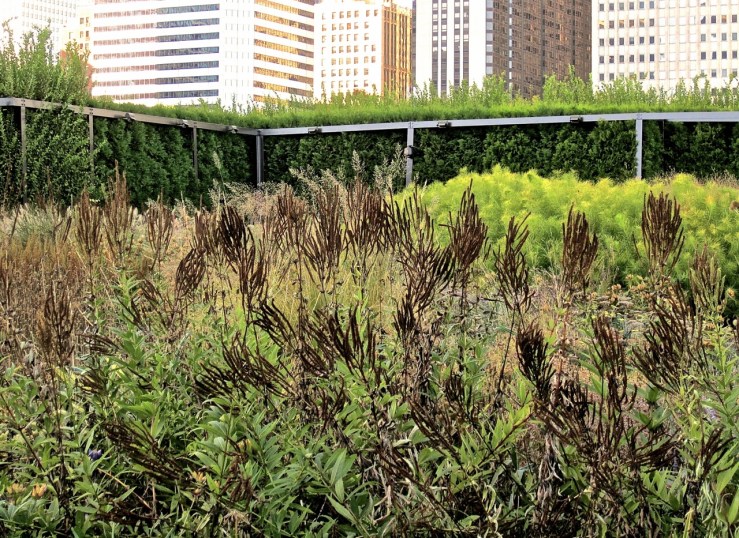
OK, that works.
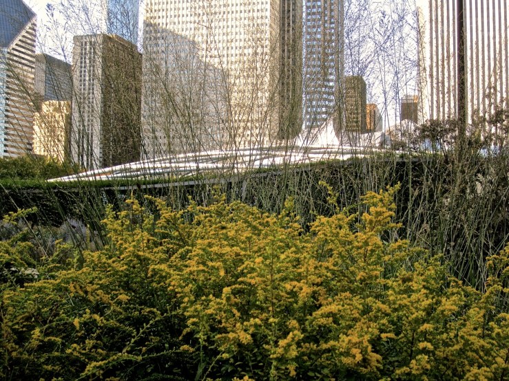

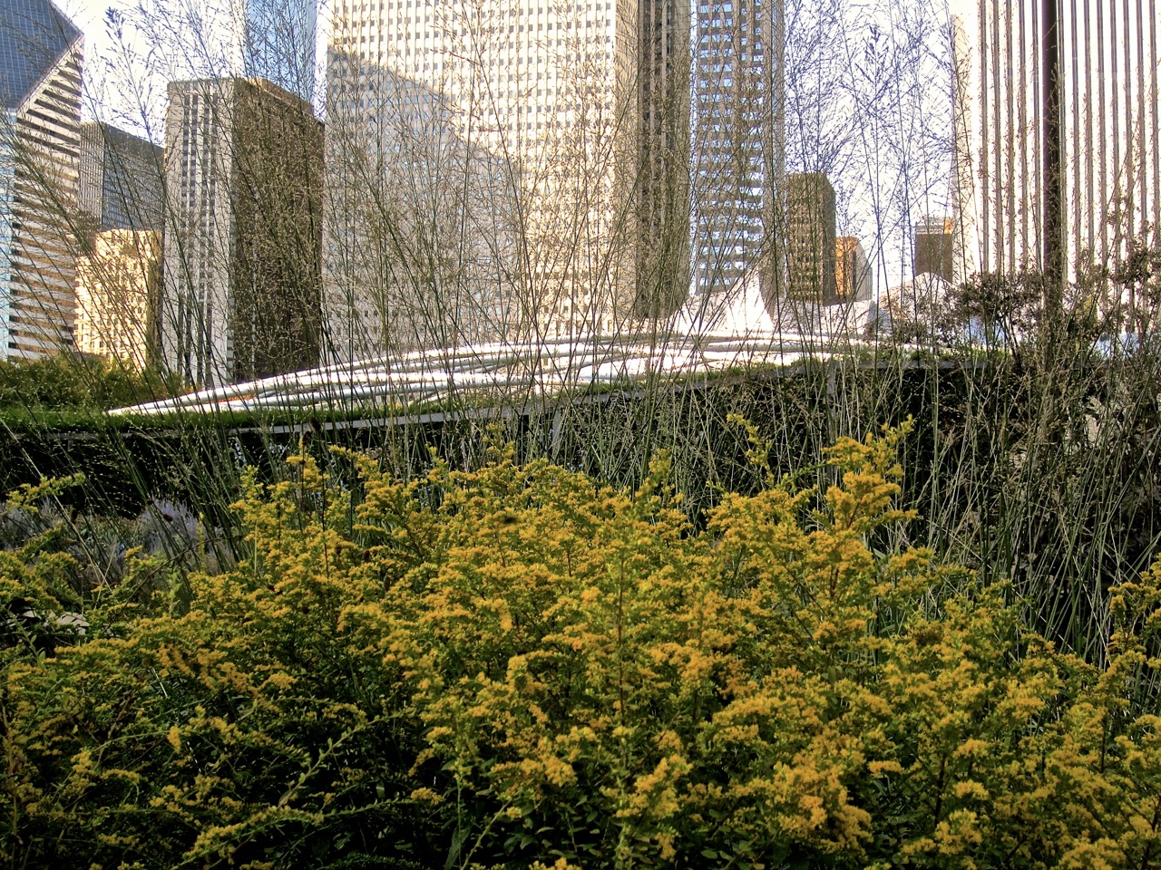
Above, in a yellow section of the garden, an ornamental grass is a transparent curtain across the city buildings.

*with Gustafson, Guthrie, Nichol, Ltd., and Robert Israel.

A dachterrasse and Friday miscellany

I recently discovered the beautiful German blog Gartenblick  (Garden View) by Dusseldorf photographer Sibylle Pietrek.

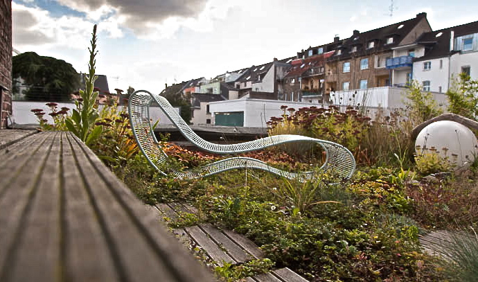
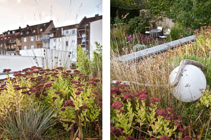
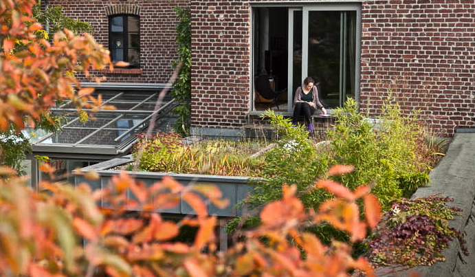
I particularly liked this post about her small, but really lovely, roof terrace (dachterrace).  I was impressed that the designer  — Karim Rashid — could achieve a real sense of an edge of a meadow (with a lounge chair) in so few square feet.

In her post, Sibylle writes that she uses the space for “early evening aperitif, photo shoots, painting, reading, and painting nails.” And to catch the long autumn afternoon sun.  What a nice refuge.

I’m starting to  think about the possibilities for the flat porch roof of our house back in D.C. . . .

All the above photos: ©Sibylle Pietrek, used here with permission.  Please check her blog before pinning or sharing.

Miscellany

Please check out Garden Rant’s review of October annuals at the Smithsonian Institution’s gardens.  Again, why are the S.I. gardens so wonderful and its neighbor, the White House, has this?

Have you seen the online Landscape Architect’s Guide to Washington, D.C., featuring write-ups by 20 L.A.s on 75 historic and contemporary landscapes?  I wish it were somewhat more opinionated (see above), but it’s useful for a visit to the Capital.

“The Global Garden,” the weekly series of the Los Angeles Times’s home and garden blog, explores “multicultural L.A. through the lens of its landscapes.”  Now it has created a library of its posts, here. In the last year, the series has looked at sugar cane, shiso, loquat, purslane, moringa, sweet lemon, ice cream bean, and more. It will continue to update the archive with new material.

I really like this garden by the firm Covachita in San Pedro, Mexico (I believe it’s their studio).  It effectively combines edgy modern urban with antique farm.

The “Urban Jungle” columns by Patterson Clark in The Washington Post are always so interesting, especially this recent one about milkweed (Asclepias syriaca — the light pink one).  If yours left pods and white fluff all over your garden in September, consider how — during World War II — you (or your enterprising child) could have been paid about 15¢ a bushel for them.  The Japanese occupation of Java had cut off supplies of kapok — a fiber (then) needed to fill life vests.

ADDENDUM: I clicked on ‘publish’ and then found one more. I have to admit I love this sort of thing.